
History
The history of the English-speaking alphabet is attributed back to the Romans and their letterform inscriptions. One of the best samples of these inscriptions can be found cut into the base of Trajan’s Column, a finely carved column depicting Roman history. It was this well-preserved sample that inspired most serif fonts that we have today and the namesake for the typeface Trajan.
Times New Roman (TNR) was created in the 1930’s – yet not a direct revival of any historical typeface. TNR came about as a project by Stanley Morison to redesign the font for the London newspaper The Times. Morison had become quite a letterface historian and was working for the English Monotype Company at the time. The Times wanted a crisp, clean font that could be used at any size and for any need of the newspaper (e.g. headlines, columns, small advertisements, etc.).
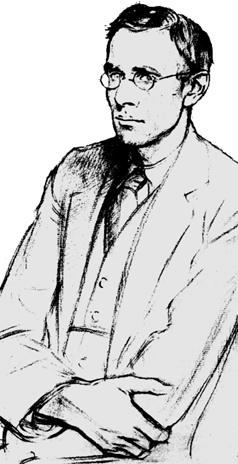 With the assistance of Victor Lardent, a lettering artist at The Times, Morison created the new design. The font they use prior had been known as Times Old Roman, thusly resulting in the new letterform design being called Times New Roman.
Controversy
However, there is some question to the legitimacy to Morison’s design. In the 1990’s a type specialist by the name of Mike Parker was asked to review a set of type plates being identified as being produced by the Lanson Monotype Company in 1915 commissioned for yacht and aircraft mogul Starling Burgess. The Lanson Company closed in 1916 due to financial problems and the plant burned down in 1918. It is suggested that The Lanson Company may have sent the plates to English Monotype Company to see if they had any use for it. There is no evidence that Morison ever saw the plates prior to creating TNR, but according to From Gutenberg to Open Type (Dodd, 109), “The similarity seems more than a coincidence.”
Common Uses
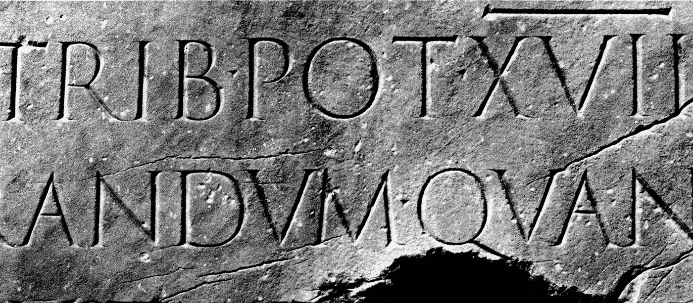
TNR is considered a Modern font and became very popular with printers after its use in The Times. The capitals are squared off, much like those on Trajan’s Column, has relatively short ascenders and descenders and sharply cut serifs. It is a practical and conservative letterform. Due to its popularity, TNR was one of the earliest fonts to be digitally converted for use on the computer. It was the typical default character set in Microsoft Word, until Office 2008 which uses Cambria; a similar-looking font that was designed for its readability on screen and at smaller sizes; the attributes that TNR was lacking.
Personal Thoughts
In my own opinion, Times New Roman is a heavily overused font-face due to it being the default in MS Word for so long, not to mention its prior history of overuse in printing. Corporate memos, Christmas letters, personal memoirs, homemade birthday invitations all come to mind when I think of TNR. It has become a font that everyone knows, which, like the other well-known fonts like Arial and Verdana become over-used by laypeople just looking for a font to serve an immediate purpose. Thankfully there are other interesting serif font options to use when the situation arises; like my previous post, Garamond.
Visual Study
For my visual study of Times New Roman, I wanted to take William Shakespeare' play Julius Caesar and portray Caesar in Times New Roman. While it is a Modern letterform, I wanted to bring the concept back to Roman times, where the serif letterform began. I was able to incorporate up to the end of Act II in to my piece which I've titled: "ET TV BRVTÉ?"

(Save image to desktop for full-size view)
Sources
Carter, Rob, Philip B. Meggs, and Ben Day. Typographic design: form and communication. 3rd ed. New York: John Wiley & Sons, 2002. Print.
Dodd, Robin. From Gutenberg to opentype: an illustrated history of type from the earliest letterforms to the latest digital fonts. Vancouver: Hartley & Marks, 2006. Print.
Images used with permission:
https://www2.bc.edu/nicole-wei/7-trajans%20column.jpg
http://tipografos.net/designers/stanley-morison.png
http://www.codex99.com/typography/images/ancient/trajan_detail_lg.jpg"
http://media.photobucket.com/image/recent/jscottbrooks/JuliusCaesarGrant-106_l.jpg