Serifa

History

Serifa is an Egyptian font – also known as slab-serif – meaning that is has thick, blocky serif that appear to be heavier than the letterform itself. Serifa was also designed by Adrian Frutiger – for more information on Adrian Frutiger, see my post on Univers. Serifa was designed in 1966 for the Bauer Foundry. Similar to Frutiger’s Univers design, he designed Serifa on a grid system, regular weight (or 'parent' face or ‘Roman’) was referred to as 55, italic 56, bold 65, black 75, light 45 and light italic 46. Serifa differs from other Egyptian typefaces (like Rockwell and Memphis) because of its more Humanist design – meaning it is based on the original Roman capitals.

Univers

History


In 1954, the method for creating typefaces was changing. The Lumitype:Photon machine – a machine that would expose photographic paper by shining light through a disk containing the desired font – changed the way typesetters were deigning typefaces. Adrian Frutiger was one of the first of those designers to design for this new machine. In just a few days Frutiger came up with the design that would become Univers, originally wanting to call the design 'Le Monde' and then, when that was rejected, 'Galaxy'. Keeping with the astrological reference, Univers was accepted. Univers is considered the first sans-serif of the photo setting age.

Symbols

This font post is unique to the rest - I'm going to deal with several fonts within one post.

Dingbats

Dingbats refer to ornamental designs (e.g., symbols, glyphs, characters) used in typesetting to decorate text. These have been around as long as printing. The forms we are commonly acquainted with are Wingdings (designed from the Lucida typeface) and Zapf Dingbats, created by Hermann Zapf (Zapfino, Palatino, Optima).

Wingdings, a set of Dingbats, were originally created in 1990 by Microsoft to be included in their Windows operating system. Wingdings is a TrueType font and consists of three sets including Wingdings 2 and Wingdings 3.

XKCD Guest Post

Baskerville

History


Baskerville is a transitional font that came about during the middle of the 18th century. John Baskerville, a man who had made a great deal of money hardening furniture and other objects through an varnishing process, once established, turned his interests to printing. J. Baskerville designed his typeface and had his employee, John Hardy, cut the punches for him. The work took several years because of Baskerville’s perfectionist behavior. He also went on to find new ways to improve upon the printing press to allow for greater precision.

Design Differences


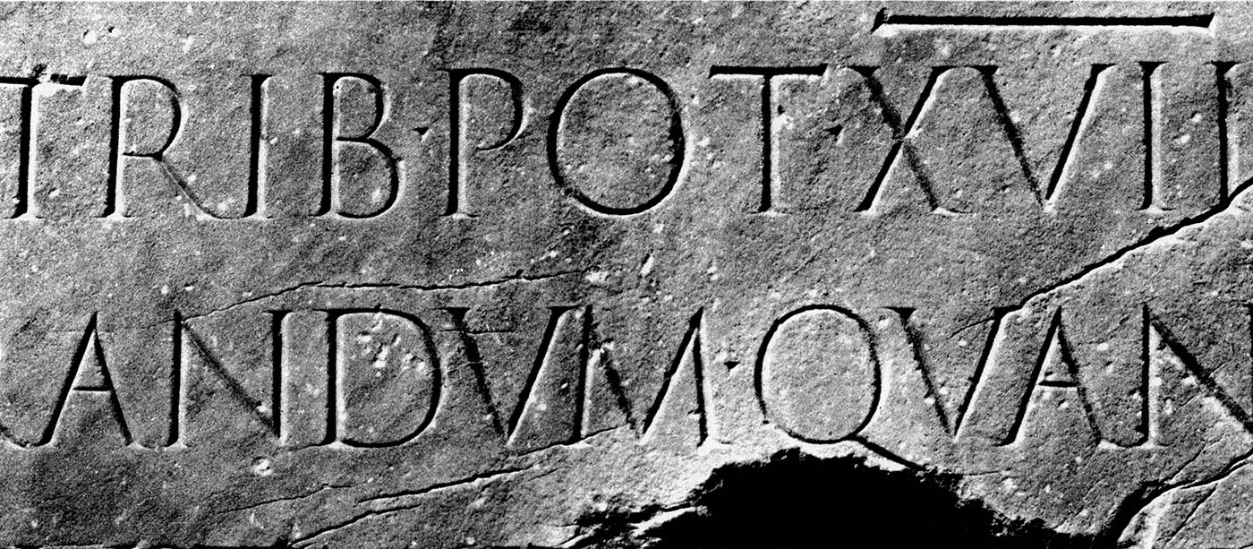
Baskerville, the letterform, is known for its wider form and moderate stroke. It is noted that Baskerville gives a page a light gray appearance because of its form width and balance with the pages white space.

Another characteristic to point out in Baskerville is the tail of the capital ‘Q’ – it first sharply strikes to the left and then folds to the right, slightly tucking under the next letter, similar to the finish of a calligraphic capital ‘Q’. An interesting characteristic can be found in the tail of the lowercase ‘g’. Its descender does not make a fully closed loop, but tucks around itself like the tail of an animal. Additionally, the cross bar of the lowercase ‘e’ is high and the lowercase ‘j’ descender tucks to the left.


Famous Fans


Ben Franklin was an admirer of the Baskerville letterform. Being a printer himself, he could appreciate the simple and delicate lines that Baskerville offers.

Visual Study


'A Study in Q' - Shading provided by the first chapter of The Hound of the Baskervilles by Sir Arthur Conan Doyle


Sources


Carter, Rob, Philip B. Meggs, and Ben Day. Typographic design: form and communication. 3rd ed. New York: John Wiley & Sons, 2002. Print.

Dodd, Robin. From Gutenberg to opentype: an illustrated history of type from the earliest letterforms to the latest digital fonts. Vancouver: Hartley & Marks, 2006. Print.

Images used with permission:
http://www.stormtype.com/services/get_poster.php?man_id=3
http://4.bp.blogspot.com/_9vzd2fD5z7o/TLOQUDq00nI/AAAAAAAAAmI/iaBnNiGjqLA/s1600/152807.gif
http://cdn.ilovetypography.com/img/g-glyph-baskerville-old-face.gif

Zapfino

History


Hermann Zapf was born in Nuremberg on November 9, 1918. At ten years old, his father, active in the trade unions, was taken to Dachau when the National Socialist Party came into power and brought down the unions. Due to his father’s political record, Hermann was not able to go in to the electrical trade as he had wished. In 1934 Hermann started as an apprentice lithographic retoucher.

Inspired by seeing a Rudolf Koch calligraphy exhibition on 1935, Zapf began teaching himself calligraphy. Zapf’s new talent was noticed and through the D Stemple AG typefoundry in Frankfurt and in 1938 he designed his first typeface, a blackletter design called Gilgenart.

His love for calligraphy grew with time. Zapf went on to design several very now famous typefaces like Palatino and Optima, both of which are heavily influenced by his appreciation of calligraphy.

In 1948, Zapf designed a calligraphic script font – based on samples from his sketchbooks – call Virtuosa. He was disappointed with restrictions of designing the script font using metal plates. Zapf felt the kerning was wrong and the slant was too harsh. He intended for “exuberant flourishes” which the metal could not provide.

In 1993, with the help of another typographer, David Siegel (Tekton) and programmer Gino Lee, began digitizing Zapf’s original script concept, calling it Zapfino. Zapfino, completed in 1998, finally realized Zapf’s original concept for his calligraphic font. The Zapfino fontset includes One, Two, Three, Four, Ligatures and Ornaments, and is essentially a complete digital calligraphic kit.


Visual Study


I use Zapfino when a client is looking for an “elegant” wedding invitation design. It is a clean and whispy font that has plenty of variations to avoid repetition that comes from using digital script fonts. The only complaint that I have is that (for some clients) the weight of the font is not heavy enough (i.e., there is no ‘Zapfino Bold’). When this is an issue, I outline the font and offset it by one or two pixels (depending on the font size being used), which typically satisfies the client and doesn’t detract from the design of font.


Sources


Dodd, Robin. From Gutenberg to opentype: an illustrated history of type from the earliest letterforms to the latest digital fonts. Vancouver: Hartley & Marks, 2006. Print.

"Download Zapfino® font family - Linotype.com." Download fonts from classic to cool - Linotype.com. N.p., n.d. Web. 23 Feb. 2012. .

"Linotype Zapfino™ - Desktop font « MyFonts." MyFonts: Webfonts & Desktop Fonts. N.p., n.d. Web. 23 Feb. 2012. .

"Virtuosa - Font News." Download fonts from classic to cool - Linotype.com. N.p., n.d. Web. 23 Feb. 2012. .

"Zapfino - Fonts.com." Fonts.com. N.p., n.d. Web. 23 Feb. 2012. .

"Zapfino - Wikipedia, the free encyclopedia." Wikipedia, the free encyclopedia. N.p., n.d. Web. 23 Feb. 2012. .


Images used without permission:

http://naranho.files.wordpress.com/2011/08/zaph0.jpg
http://image.linotype.com/news/fontnews/virtuosaclassic/virtuosa_sample01.gif
http://origin.myfonts.net/116/fs/u/5b/3776da4b764dc34c897cd0fe66b7fb.gif

Chunk (Five)

Reason


The reason I choose to write this post about Chunk (Five) – referred to in the rest of this post as 'CF' – is, I was working on a project for a colleague a few weeks ago and I had to download it for a design that I was given to edit. I became so enamored with the font that I decided to update my website logo using CF (see Goodarts dot Net, above). I was curious to se where CF came from and decided to spotlight the typeface in today's post.

History


CF is a modern, ultra-bold slab serif designed by Meredith Mandel circa 2009. Very little detail is available on CF. Meredith Mandel says on her website that she designed it to be "reminiscent of old American Western woodcuts, broadsides, and newspaper headlines". Font-A-Day notes that CF was designed for The League of Moveable Type. The League is a collaborative of designers seeking to advance the use of type and available typefaces on the web.

With the advent of the css styling @font-face – first with IE4 and Netscape 4, then revitalized with Safari 3.1 support, now all modern browsers support the @font-face technique. @font-face allows front-end designers to code in a reference to a font file that is hosted on their server, then assign that font to a css font tag (e.g., h1, h2, p, a, etc.) that will then display that font the same to all users. This was a huge leap forward in text layout for web designers.

I started using @font-face for my own projects a little over a year ago. It is very beneficial for web designers to be able to choose what font every user will see, rather than relying on system fonts to show an approximation of what the deign intended. An alternate option was to create images for each instance of that font (e.g., headers, titles, etc.) which, in turn adds increased download to a website and lends to accessibility by allowing screen readers to directly read the instances rather than rely on alt tags.

Visual Study


For today's visual study, I submit the new Goodarts dot Net logo (also at top of page) and my new Ciricullum Vitea design:


Sources


"Chunk | The League of Moveable Type." The League of Moveable Type. N.p., n.d. Web. 21 Feb. 2012. .

Cuppyhouse, Ronald. "Chunk Five | Font-A-Day." Fontaday - A new free downloadable TTF or OTF font every day!. N.p., n.d. Web. 21 Feb. 2012. .

Hermann, Ralf. "The @Font-Face Rule And Useful Web Font Tricks | Smashing Magazine." Smashing Magazine. N.p., n.d. Web. 21 Feb. 2012. .

Mandel, Meredith. "meredithmandel." meredithmandel. N.p., n.d. Web. 21 Feb. 2012. .

Images used without permission:
http://payload.cargocollective.com/1/0/28893/379252/CHUNK_POSTER.jpg

The Next Web: 5 Awesome Experimental Typefaces That Bring Together Tech Art Design

I found this while broswing for new design and font ideas.

http://thenextweb.com/dd/2012/02/20/5-awesome-experimental-typefaces-that-bring-together-tech-art-design/?%2Bdesign

Helvetica

History


Helvetica was designed by Max Miedinger, Alfred and Edouard Hoffman in the mid 1950s. The three worked for the Haas typefoundery in Munchenstein, Switzerland. Their intent was to produce a competitive, new san-serif typeface. At the time Switzerland was known for its clean, high-end design. Miedinger, the lead designer on the font project, based his first designs on Schelter Grotesk, a popular sans-serif from the late 1800s. Helvetica was originally released in 1056 under the name Neue Haas Grotesk. Neue Hass wasn't very popular in Switzerland after its release because Swiss designers were very happy using Akzidenz-Grotesk.

In 1961, Neue Haas was released by the Haas parent foundry, D Stempel AG, in Frankfurt, West Germany. The typeface was then renamed to the latin name for 'Swiss', Helvetica (the full latin name for Switzerland being 'Confoederatio Helvetica'). The reasoning behind the renaming was to encompass the world-renowned Swiss design style.

In 1983, D Stempel AG licensed Linotype Design Studio to digitize and update Helvetica for use as a digital font. At this point Helvetica became very popular, much like Times New Roman for similar reasons. Helvetica is one of those fonts that you either love or hate – much like Arial or Verdana. This tends to be because of availability of these font sets on every digital text interface; availability then leads to misuse and overuse.

Design Differences


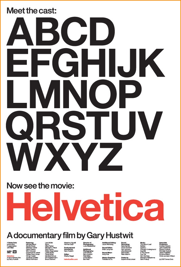
Modern, digital Helvetica has about 19 variations (regular, condensed, compressed, rounded, roman, narrow, etc.). It can be identified from other sans-serif fonts by its very round capitals in the 'C', 'G', 'O' and 'Q'. The terminals of the 'C', 'G', 'S', 'a', 'c', 'e', and 's' are horizontal, unlike Akzidenz which have terminals closer to 45 degrees.

The Movie


In 2007, Gary Hustwit created a documentary on Helvetica, celebrating it's 50th anniversary. The documentary goes in to detail the history and uses of the typeface. The movie is very interesting for those interested in design and typography.

Watch Helvetica on Netflix Watch It Now

Visual Study


Sources


Dodd, Robin. From Gutenberg to opentype: an illustrated history of type from the earliest letterforms to the latest digital fonts. Vancouver: Hartley & Marks, 2006. Print.

"Helvetica - Wikipedia, the free encyclopedia." Wikipedia, the free encyclopedia. N.p., n.d. Web. 16 Feb. 2012. .

Images used without permission:
dullmen.files.wordpress.com/2009/12/miedinger0.jpg

4.bp.blogspot.com/_fT9E7lrkBgY/TO1dI_oc-FI/AAAAAAAAAJQ/Aq3r9NpfIfI/s1600/helvetica.jpg

1920 / 1912 Font Books Digitized!


1910 German Font Book

1912 American Type Founders specimen book

Blackletter

History


Blackletter was born from regional handwriting types in Europe around the 15th century. Originally it was a script type mimicked by those copying books, manuscripts or other parchments. In northern Europe (Germanic regions) this script type became known as Gothic (script, miniscule) or Blackletter. Textura was the first known variant; others that followed were Schwabacher, Fraktur and Cursiva. It was from Textura that Johannes Gutenberg, also known as the father of the printing press, modeled his first movable type press letterforms.


Blackletter was the letterform of the Renaissance period. Additional variants arose like “white letter”, a more Roman style of Blackletter, but still retaining a heavily Gothic form. Blackletter is commonly associated with Germany, specifically Fraktur, which appeared on many of Germany’s flags. It was the font the was adopted early by the National Socialist party for use of their propaganda materials. Leni Riefenstahl’s pro-Nazi film, Triumph of Will, promotional materials and titles were created using Blackletter (Fraktur and Schwabacher). It was during WWII that Blackletter became recognized more as Nazi type than German type.

Current Uses


Post WWII, after the defeat of the Nazi’s, use of Blackletter in Germany quickly ended because of its association. Modern uses tend to be associated with bands like AC/DC, metal bands or motorcycle gangs.


Visual Study


Sources


"Blackletter - Wikipedia, the free encyclopedia." Wikipedia, the free encyclopedia. N.p., n.d. Web. 2 Feb. 2012. .

Dodd, Robin. From Gutenberg to opentype: an illustrated history of type from the earliest letterforms to the latest digital fonts. Vancouver: Hartley & Marks, 2006. Print.

"Typography | Retinart." Retinart - Reflections on the Joyous Elegance of Graphic Design and Creative Thought. N.p., n.d. Web. 2 Feb. 2012. .

Images used without permission:
http://www.metalinjection.net/wp-content/uploads/2012/01/Black-Dahlia-Murder-Nile-Skeletonwitch-2012-tour.jpg

http://www.posters.ws/images/425260/west_coast_choppers_logo.jpg

http://www.retinart.net/media/images/blackletter/blackletter-chart.jpg

Akzidenz-Grotesk

Pronounced "Accidents Grotesque".


History


Akzidenz-Grotesk was released by the Berthold Type Foundry originally under the name "Accidenz-Grotesk" in 1896. Hermann Berthold started his type foundry in Berlin in 1858. The Berthold foundry is famous for creating several new typesetting machines and typefaces, such as Akzidenz-Grotesk (AG). AG was the first san-serif font to be used world wide. As I stated in my Franklin Gothic post, 'Grotesk' or 'Grotesque' was the name used in Europe for what we now call 'san-serif'.


Similarities


AG is commonly mistaken for Helvetica, but AG post-dates Helvetica by 40 years. AG has a more round letterform in its capitals (such as 'C', 'G', 'O', etc.) the its san-serf counterparts. The capital 'Q' has a short ear (leg) offshoot from the bottom-right of the letterform that does not cross into the loop, as it does in Helvetica. AG also has a slab or square dot on its lowercase 'i' and a higher second-story on the lowercase 'a'. Other characters have a more elegant or European-like form, such as the numbers '2' and '7'.


Current Uses


A Chicago company, Berthold Types, ltd. is now the owner of the AG and other original Berthold copyrights. Berthold Types recently (re)released an OpenType version of the AG, named Akzidenz-Grotesk Pro, with several world languages supported.

The most popular modern use of AG is in the American Red Cross logo.


Visual Study


Sources


http://www.fonts.com/font/berthold/akzidenz-grotesk
http://en.wikipedia.org/wiki/Berthold_Type_Foundry
http://en.wikipedia.org/wiki/Akzidenz-Grotesk
http://new.myfonts.com/fonts/berthold/akzidenz-grotesk-bq/
http://www.bertholdtypes.com/font/akzidenz-grotesk/proplus/

Images used with permission:
http://3.bp.blogspot.com/-i4Y0KvO6DL4/TbaX0tthYaI/AAAAAAAAIjc/AewNJNTZ-WU/s1600/1873363809_8786cf6859.jpg
http://panhandleares.org/wp-content/uploads/2011/02/American_Red_Cross_Logo.jpg
http://upload.wikimedia.org/wikipedia/commons/d/d2/AGcomparison08.svg

Franklin Gothic

History


Morris Fuller Benton, the son of the owner of a type foundry, created Franklin Gothic (FG) in the first few years of the 20th century. FG is a sans-serif font, but unlike the other sans-serif fonts developed in the 20th century, FG retains aspects of those of the 9th century; the full loop forming a bowl in the lowercase 'g' is one example. Released in 1905, FG quickly saw a condensed version to follow, as well as an extra condensed version the following year and oblique versions in 1913. Benton developed the concept of type families. While he wasn't the first to have this idea, it was a main underlier when creating FG.

Sans-Serif?


At the point of the introduction of Franklin Gothic, sans-serf fonts had been reguarly used for about 70 years ('Antique' by Vincent Figgens in 1832) – Wiliam Caslon IV created the earliest version latin in 1916 called 'Egyptian', although no examples can be found. Since then there was much debate on what to call the new letterform. 'Grotesque' was the name adopted in Britian, while in America they were calling the form 'Gothic' - typically associated with blackletter. Franklin Gothic's creator, Benton, was an American, thus the naming of the new sans-serf: Franklin GOTHIC.

It should be noted that other sans-serif fonts of the 20th century tended to exhibit cleaner ears and open-loop lowercase letters, like the 'g'.

Common Uses


The Franklin Gothic font family consists of a wide range of weight and italics, including:
• Book (Regular, Oblique, Condensed, Compressed, Extra Compressed)
• Demi (Regular, Condensed, Compressed, Extra Compressed)
• Heavy (Regular, Oblique)

The font style can be described as "assertive" as well as friendly. This makes it "an excellent type for children's books and advertising" (Dodd, 93). It would be interesting to study what inherent differences children's books and advertising have.

Fg has a large X-height, which makes it easier to read in smaller printed type. Being that it is a sans-serif font, it is naturally easier to read on screen, but would be best used for titles or headers allowing for body text to be simpler sans-serif fonts like Helvetica or Arial.

Visual Study


Sources


Dodd, Robin. From Gutenberg to opentype: an illustrated history of type from the earliest letterforms to the latest digital fonts. Vancouver: Hartley & Marks, 2006. Print.

"Typedia: ITC Franklin Gothic." Typedia: A Shared Encyclopedia of Typefaces. N.p., n.d. Web. 23 Jan. 2012. .

Images used with permission:
http://aliceshrum.files.wordpress.com/2009/09/morris-fuller-benton_web.jpg
http://upload.wikimedia.org/wikipedia/commons/3/35/FranklinGothicSP.svg

Times New Roman


History


The history of the English-speaking alphabet is attributed back to the Romans and their letterform inscriptions. One of the best samples of these inscriptions can be found cut into the base of Trajan’s Column, a finely carved column depicting Roman history. It was this well-preserved sample that inspired most serif fonts that we have today and the namesake for the typeface Trajan.

Times New Roman (TNR) was created in the 1930’s – yet not a direct revival of any historical typeface. TNR came about as a project by Stanley Morison to redesign the font for the London newspaper The Times. Morison had become quite a letterface historian and was working for the English Monotype Company at the time. The Times wanted a crisp, clean font that could be used at any size and for any need of the newspaper (e.g. headlines, columns, small advertisements, etc.). With the assistance of Victor Lardent, a lettering artist at The Times, Morison created the new design. The font they use prior had been known as Times Old Roman, thusly resulting in the new letterform design being called Times New Roman.

Controversy


However, there is some question to the legitimacy to Morison’s design. In the 1990’s a type specialist by the name of Mike Parker was asked to review a set of type plates being identified as being produced by the Lanson Monotype Company in 1915 commissioned for yacht and aircraft mogul Starling Burgess. The Lanson Company closed in 1916 due to financial problems and the plant burned down in 1918. It is suggested that The Lanson Company may have sent the plates to English Monotype Company to see if they had any use for it. There is no evidence that Morison ever saw the plates prior to creating TNR, but according to From Gutenberg to Open Type (Dodd, 109), “The similarity seems more than a coincidence.”

Common Uses


TNR is considered a Modern font and became very popular with printers after its use in The Times. The capitals are squared off, much like those on Trajan’s Column, has relatively short ascenders and descenders and sharply cut serifs. It is a practical and conservative letterform. Due to its popularity, TNR was one of the earliest fonts to be digitally converted for use on the computer. It was the typical default character set in Microsoft Word, until Office 2008 which uses Cambria; a similar-looking font that was designed for its readability on screen and at smaller sizes; the attributes that TNR was lacking.

Personal Thoughts


In my own opinion, Times New Roman is a heavily overused font-face due to it being the default in MS Word for so long, not to mention its prior history of overuse in printing. Corporate memos, Christmas letters, personal memoirs, homemade birthday invitations all come to mind when I think of TNR. It has become a font that everyone knows, which, like the other well-known fonts like Arial and Verdana become over-used by laypeople just looking for a font to serve an immediate purpose. Thankfully there are other interesting serif font options to use when the situation arises; like my previous post, Garamond.

Visual Study


For my visual study of Times New Roman, I wanted to take William Shakespeare' play Julius Caesar and portray Caesar in Times New Roman. While it is a Modern letterform, I wanted to bring the concept back to Roman times, where the serif letterform began. I was able to incorporate up to the end of Act II in to my piece which I've titled: "ET TV BRVTÉ?"


(Save image to desktop for full-size view)

Sources


Carter, Rob, Philip B. Meggs, and Ben Day. Typographic design: form and communication. 3rd ed. New York: John Wiley & Sons, 2002. Print.

Dodd, Robin. From Gutenberg to opentype: an illustrated history of type from the earliest letterforms to the latest digital fonts. Vancouver: Hartley & Marks, 2006. Print.

Images used with permission:
https://www2.bc.edu/nicole-wei/7-trajans%20column.jpg
http://tipografos.net/designers/stanley-morison.png
http://www.codex99.com/typography/images/ancient/trajan_detail_lg.jpg"
http://media.photobucket.com/image/recent/jscottbrooks/JuliusCaesarGrant-106_l.jpg

Garamond


History


Claude Garamond was a 16th century printer. After assisting with several prominent printers he became independent and established himself as the leading French typecutter (Dodd, 30). His type was to offer a more refined Aldine roman set over the popular Gothic blackletter types that were popular at the time. Garamond was the first typecutter to combine upper and lower case italic alphabet into a companion letterform set

In 1917 the American Type Foundry created a Garamond revival based on a matrices produced for the Calvinist Academy in Sedan in the 17th century. The set was reused in 1922 by Monotype Corporation to create their Garamond set. In 1926, historian Beatrice Warde discovered a 1621 Garamond specimen set and was able to note that the matrices that both sets were based on was created by Jean Jannon, not Claude Garamond. However, because of the popularity of the new Garamond font design in bookmaking, it was impossible to then rename the face.

Common Uses


Today, Garamond remains a very popular book face. Digitally, it doesn’t lend well as a display font (for use on web or other computer applications).

Tips:
From Gutterberg to Open Type suggests reduce the Tracking as you increase the font size to maintain a good word fit.

Visual Study


Each week I will be visually implementing that week's font in some way - comparative, artistic or simply showing the font in use.

For Garamond, being that it is the first font picked for this blog, I decided that a font comparison would be best. Since Garamond is an Old-Style/Old-Face font I wanted to compare it against other Old-Style fonts as well as Transitional and Modern designs. This is what I've come up with:


Sources


Carter, Rob, Philip B. Meggs, and Ben Day. Typographic design: form and communication. 3rd ed. New York: John Wiley & Sons, 2002. Print.

Dodd, Robin. From Gutenberg to opentype: an illustrated history of type from the earliest letterforms to the latest digital fonts. Vancouver: Hartley & Marks, 2006. Print.

Images used without permission:
http://upload.wikimedia.org/wikipedia/commons/3/31/ClaudeGaramond.jpeg
http://berkedoganogluva312.files.wordpress.com/2011/11/garamond.jpg

Typography: Terms & Definitions


There are several terms that are regularly used when discussing font faces that may not be commonly understood by the layperson. This introduction to my typography blog will cover the definitions of some of those basic terms. The definitions I'm using here are found in Typographic Design: Form and Communication, 5th edition. However, these are terms that date back to the beginning of of printing and moveable type and similar definitions can be found elsewhere.

Describing Letters


Baseline: The imaginary that the base of each capital sits.
Capline: The imaginary line that runs along the top of the capital letters.
Meanline: The imaginary line that establishes the height of the body of lowercase letters. This is often the 'mean' between the Capline and Baseline.
Beard line: The imaginary line that runs along the bottom of the descenders.
x-height: The distance from the Baseline to the Meanline. This is typically the height of lowercase letters (most easily measured on the lowercase 'x').
Optics: All characters align optically on the Baseline. The body height of lowercase characters align optically at the x-height and the tops of the capitals align at the top of the Capline.
Ascender: A stroke on a lowercase letter that rises above the Meanline.
Descender: A stroke on a lowercase letter that falls below the Baseline.
Serif: The short strokes that extend from and at an angle on the upper and lower ends of the major strokes of a letterform.
Sans-Serif: Describes a letterform without Serifs.
Stroke: Any of the linear elements within a letterform.

There are additional terms describing the nuances of type (Bowl Counter, Ear, Eye, Hairline, Leg, Spur, Stem, Tail...) that I may further cover in later posts if the need arises, when discussing specific fontfaces.

Weight: The ratio between the relative width of the strokes of a letterform and its height. This is described as Bold or Light.
Width: The ratio between the black vertical strokes and the intervals of white (i.e., whitespace or negative space - the enclosed area - bowl, loop or eye). This is described as Expanded or Condensed.
Thick/Thin Contrast: The visual relationship between a letters thickest and thinnest parts.
Stress: The visual axis of a letter.

Letterspacing


Leading: (pronounced LED-ing) The vertical space between lines of text. The name comes from original typesetters would add pieces of lead between lines of type to create more space. Non-designers are most familiar with this concept from the program Microsoft Word where it is simplified as 'single' or 'double-spaced'. In this example, the term 'double-spaced' would mean that if you are using a 12 point font there would be a (approximately) 24 point space between lines. More Leading (in the 'double-space' example) makes each line of text easier to read. Most books read for leisure would have more leading.
Tracking: Tracking is the consistant horizontal spacing between characters. Smaller type tends to need a wider Tracking, while Larger type like headers or titles can have a tighter Tracking.
Kerning: The horizontal spacing between individual characters. This is different between Tracking because it deals specifically with pair of characters. You may apply Tracking to a block of text, but you would apply Kerning to individual letter pairs to adjust them if they look spaced visually incorrect.

Sources


Carter, Rob, Philip B. Meggs, and Ben Day. Typographic design: form and communication. 3rd ed. New York: John Wiley & Sons, 2002. Print.

Dodd, Robin. From Gutenberg to opentype: an illustrated history of type from the earliest letterforms to the latest digital fonts. Vancouver: Hartley & Marks, 2006. Print.

Type samples image used without permission, from Typographic Design: Form and Communication, 5th ed., Carter/Day/Meggs

Site design by Ryan G. Wilson Amy Trager, © 2006-2015