Pronounced "Accidents Grotesque".
History

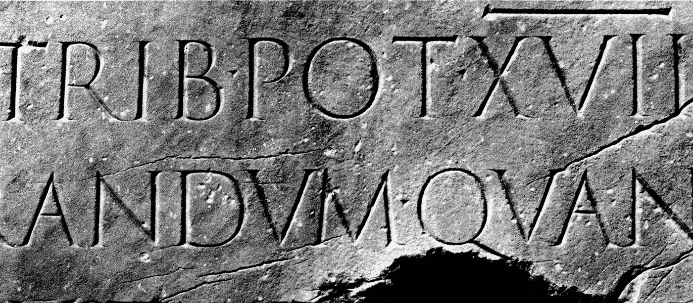
Akzidenz-Grotesk was released by the Berthold Type Foundry originally under the name "Accidenz-Grotesk" in 1896. Hermann Berthold started his type foundry in Berlin in 1858. The Berthold foundry is famous for creating several new typesetting machines and typefaces, such as Akzidenz-Grotesk (AG). AG was the first san-serif font to be used world wide. As I stated in my Franklin Gothic post, 'Grotesk' or 'Grotesque' was the name used in Europe for what we now call 'san-serif'.
Similarities

AG is commonly mistaken for Helvetica, but AG post-dates Helvetica by 40 years. AG has a more round letterform in its capitals (such as 'C', 'G', 'O', etc.) the its san-serf counterparts. The capital 'Q' has a short ear (leg) offshoot from the bottom-right of the letterform that does not cross into the loop, as it does in Helvetica. AG also has a slab or square dot on its lowercase 'i' and a higher second-story on the lowercase 'a'. Other characters have a more elegant or European-like form, such as the numbers '2' and '7'.
Current Uses
A Chicago company, Berthold Types, ltd. is now the owner of the AG and other original Berthold copyrights. Berthold Types recently (re)released an OpenType version of the AG, named ![]() Akzidenz-Grotesk Pro, with several world languages supported.
Akzidenz-Grotesk Pro, with several world languages supported.
The most popular modern use of AG is in the American Red Cross logo.
Visual Study

Sources
http://www.fonts.com/font/berthold/akzidenz-grotesk
http://en.wikipedia.org/wiki/Berthold_Type_Foundry
http://en.wikipedia.org/wiki/Akzidenz-Grotesk
http://new.myfonts.com/fonts/berthold/akzidenz-grotesk-bq/
http://www.bertholdtypes.com/font/akzidenz-grotesk/proplus/
Images used with permission:
https://blogger.googleusercontent.com/img/b/R29vZ2xl/AVvXsEg96wCNz39t3sDJaWPHrRuSxBlAa5-JyViH-S79IQS8Ve9iREtHJa7c5or4fdtJrj6A5tXXkyJK6SOnpBBt3giXrzYvUYMhnzgv2d3DYB0IlkZ-t7AQW6OtOYHBVm0BrQjzYiI5L5fAO3I/s1600/1873363809_8786cf6859.jpg
http://panhandleares.org/wp-content/uploads/2011/02/American_Red_Cross_Logo.jpg
http://upload.wikimedia.org/wikipedia/commons/d/d2/AGcomparison08.svg
 Morris Fuller Benton, the son of the owner of a type foundry, created Franklin Gothic (FG) in the first few years of the 20th century. FG is a sans-serif font, but unlike the other sans-serif fonts developed in the 20th century, FG retains aspects of those of the 9th century; the full loop forming a bowl in the lowercase 'g' is one example. Released in 1905, FG quickly saw a condensed version to follow, as well as an extra condensed version the following year and oblique versions in 1913. Benton developed the concept of type families. While he wasn't the first to have this idea, it was a main underlier when creating FG.
 The Franklin Gothic font family consists of a wide range of weight and italics, including:


 With the assistance of Victor Lardent, a lettering artist at The Times, Morison created the new design. The font they use prior had been known as Times Old Roman, thusly resulting in the new letterform design being called Times New Roman.